8,331 search results
(0.032 seconds)
- Rennie Mackintosh by CRMFontCo,
$35.00The Classic Charles Rennie Mackintosh Font. Created in 1993, the timeless beauty of Charles Rennie Mackintosh’s letterforms is now available at MyFonts for the first time. Often imitated, but never bettered, this font has been used in various projects all over the globe, enjoying the limelight of Hollywood when it was requested for use in Sam Raimi’s second “Spider Man” adventure. A form of this font has subsequently been used for the TV series “An American Horror Story”. - Greenwich Village JNL by Jeff Levine,
$29.00 For decades, the Greenwich Village area of New York was a home for artists, poets, writers and free-thinkers of their time who were labeled "Bohemians" because of their non-conformist approach to life and the arts. Greenwich Village JNL is an Art Nouveau-influenced typeface with a Bohemian approach in its double crossbars on the A and H; all the while being a nice example of hand lettering found on a vintage piece of sheet music.
 - Whitley by Arendxstudio,
$18.00 Whitley is a handwritten signature font package with a personal charm. With a style that I feel is the first time being blended with a different brush so it has a natural hand. It includes Whitley Alt weights which have alternative characters, both with capital letters and small that is completely new. Ligatures are available for some lowercase letters (more natural double letters). This can be accessed through software with different devices or glyph panels, e.g. Photoshop / Illustrator.
 - Full Blast by Hanoded,
$15.00 I was cleaning out my pencil box and found an old marker pen. I wanted to throw it away, because it was leaking all over my stuff, but decided I could use it one more time. The result is Full Blast font: a ‘brush’ font (made with that leaking old marker pen). Use if for your fireworks packaging, fiery pepper sauce bottles and whoopee cushions (and just about anything else as well). Comes with an explosive amount of diacritics.
 - Losthouse by Maulana Creative,
$12.00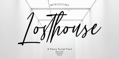 Losthouse is fancy script font, with clean felt tip stroke and fun character. It has Opentype features of ligatures character, To give you an extra creative work. Losthouse script font support multilingual more than 100+ language. This font is good for logo design, Social media, Movie Titles, Books Titles, a short text even a long text letter and good for your secondary text font with sans or serif. Make a stunning work with Losthouse script font. Cheers, MaulanaCreative
 - Simply Grotesk JNL by Jeff Levine,
$29.00 Up until the advent of vinyl plotters, computers and a myriad of other typesetting and printing changes the world has experienced over the past few decades, the art of hand lettering flourished. An early 1900s book on show card writing displayed a nice example of a Grotesk typeface (a popular style of sans serif of the time). This has been redrawn digitally as Simply Grotesk JNL and is available in four varieties - regular, oblique, condensed and condensed oblique.
 - Intellections by Maulana Creative,
$12.00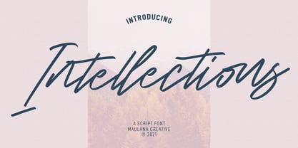 Intellections is a signature script font. With regular felt-tip stroke, fun character with a bit of ligatures and lowercase alternates. To give you an extra creative work. Intellections font support multilingual more than 100+ language. This font is good for logo design, Social media, Movie Titles, Books Titles, a short text even a long text letter and good for your secondary text font with sans or serif. Make a stunning work with Intellections font. Cheers, MaulanaCreative
 - Captain Quill by Ascender,
$29.99Captain Quill is a lively calligraphic style script font designed by Jim Ford, based on the handwriting of a fictional pirate figure named Paul Pierce, aka Captain Quill. The Captain Quill font is an exciting font that's loaded with adventure, perfect for pirate-themed documents, scrapbooking, invitations and correspondence. Creative Professionals will find the Captain Quill font useful for everything from logos, packaging, menus & headlines, as it lends an old-worldly feel with its authentic rough texture. - Lah Kagok by Differentialtype,
$12.00 Lah Kagok is an elegant and luxurious serif font family. This font comes with 8 weights accompanied by italics. The lowercase is inspired by an italic serif, which this time is also used for the upright style. Whatever design you make, this font is perfect to complement it. This font is also equipped with alternate calligraphy on the uppercase, don't forget to activate it to add an elegant and luxurious impression to each of your projects.
 - Infamous Rush by Maulana Creative,
$15.00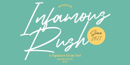 Infamous Rush is a fancy signature font. With sharp felt-tip stroke, slanted and fun character with a bit of ligatures. To give you an extra creative work. Infamous Rush font support multilingual more than 100+ language. This font is good for logo design, Social media, Movie Titles, Books Titles, a short text even a long text letter and good for your secondary text font with sans or serif. Make a stunning work with Infamous Rush font. Cheers, MaulanaCreative
 - Mollinder by TypeClassHeroes,
$17.00 Mollinder is a Aesthetic script come with retro and refined style, you can explore and combine creating rhythm for comfortable reading. This font perfect for any projects, such logotype, stickers, greeting / wedding cards, packaging design, headlines, brand identity, t-shirt, posters, magazines, books, Instagram, websites, and many more. Feature Uppercase & Lowercase Number & Symbol International Glyphs Multilingual support Alternative Ligature Feel free to drop us a message any time and follow my shop for upcoming updates. Hope you enjoy it.
 - Euroque by CozyFonts,
$20.00 Euroque is the 23rd font family from Cozyfonts Foundry, a California Foundry established in 2012 by designer and typographic illustrator Tom Nikosey Euroque began with pencil sketches, as all my fonts trace their beginnings. Influenced by European poster art of the 1920s and 1930s Euroque takes its name almost literally, European Style. These fonts are designed as a Small Caps Family, where the lower case mirrors the Upper case in design but its weights are compatible and consistent.
 - Tactic Round by Miller Type Foundry,
$35.00 Tactic Round is the softer cousin to Tactic Sans. Seven weights times three widths, all with italics, means that Tactic Round has forty-two options to make every design accomplish its mission. From technology to sports, posters to email blasts, Tactic Sans works for almost any project. Tactic Sans supports extended Latin alphabets as well as Cyrillic alphabets. Opentype accessories include: Alternate Characters, Tabular Lining Figures, Ligatures (including symbol ligatures), Numerators (including $¢£€¥ƒ#%) Denominators Superscript & Subscript, Fractions and more!
 - Blinkford by Nathatype,
$29.00 Step back in time and embrace the nostalgic allure of Blinkford, a captivating uppercase display font that transports you to a vintage charm. The characters are bold and robust, evoking a sense of grandeur and prominence that harks back to a bygone era. The open layout enhances legibility and imparts a sense of spaciousness that is characteristic of vintage typography. As a special bonus, this font includes ornaments. Blinkford fits in headlines, logos, branding materials, and many more.
 - Victoria Rogers by Rillatype,
$20.00 Proudly introducing, Victoria Rogers! Victoria Rogers is a special font that crafted carefully with heart and aimed to achieve the purpose of this font to be used as an elegant editorial font, but you can use it for anything you want! This font is special because the uppercase and lowercase have different style, uppercase with feminine feel with swash, and lowercase with thin and crips elegant display serif, mix them both and voila, you have an elegant design instantly!
 - Tsubame by Thirdin,
$30.00 "TSUBAME" means swallow in Japanese. These fonts are based on the shape of Tsubame. The relationship between humans and swallows is as deep-rooted. Japanese swallows have adapted to nesting in and around human habitation from ancient time. So in Japan, they prohibited people from catching or killing swallows because of their beneficial role as insect eaters. Since the relationship between humans and swallows is close, this font's letter spacing is designed to be very tight.
 - Novaria Vista by Sipanji21,
$20.00 "Novaria Vista" is a futuristic display font. Fonts with a futuristic theme often embrace technological and forward-looking aesthetics. They are commonly used in various design projects that aim to convey modernity, innovation, and a vision of the future. With "Novaria Vista," you can create designs that exude a sense of advancement and a futuristic touch. This font is suitable for projects related to technology, science fiction, space exploration, and other themes where a futuristic style is desired.
 - Screwball Comedy JNL by Jeff Levine,
$29.00 Cary Grant was one of Hollywood’s most versatile actors, playing romantic leads, dramatic parts and showing off his impeccable timing in screwball comedies. A perfect example of this is Frank Capra’s “Arsenic and Old Lace” from 1942. The movie trailer for the film had the title hand lettered in a playful and casual slab serif style, with varying character shapes and weights. This is now available as Screwball Comedy JNL in both regular and oblique versions.
 - Manifestor by Stawix,
$40.00 Manifestor is designed to be an urban culture typeface, it can effortlessly fit, blend and be in very situation at any time without taking up too much attention. It has a clean san-serif structure and proportion, kind to the eyes when set in texts while also look reliable when use in big scale. Manifestor has the simple - easy - comfortable feature, therefore it is a type appropriate for a very wide range of occasion. Manifestor also comes in Variable!
 - Dinzy Minzy by The Printers,
$20.00 If you are looking for an expressive, witty and whimsical typeface, Dinzy Minzy will beckon to a change of pace for any designer looking to create space, time and lighthearted imagery. This typeface draws you into the message of the mind, lending fresh, new life to party, holiday and grand opening invitations. Whether it's a poster, a billboard, or the card in the mail, Dinzy Minzy will be sure to capture attention and turn on the senses.
 - Kento by Graphicfresh,
$18.00 This time we present a font with a bit of a classic touch. The font is slightly stretched to the sides. The font is simple and luxurious, so it leaves a deep memory impression when used on a brand. Simple and powerful. This is an overview of the font as a whole. Kento will be perfect for many projects: fashion, magazines, logos, branding, photography, invitations, wedding invitation, quotes, blog headers, posters, advertisements, postcards, books, websites, etc.
 - Periodical JNL by Jeff Levine,
$29.00 Periodical JNL is based on one the many stylized titles from the cover of the 1920s Spanish magazine "Nuevo Mundo" (New World). Each cover displayed a beautiful piece of period artwork along with the magazine's name in different lettering styles of the time (Art Nouveau and early Art Deco). The original design features an "engraved" look and now has an oblique counterpart. Also available are solid versions (without the inside lines) in both regular and oblique styles.
 - Organic Tuesday by Bogstav,
$15.00 Sometimes you need things organised in a neat way. Organic Tuesday has that, but also a will to break free at the same time. Years ago I was at a restaurant where the menu was handwritten with a clumsy, but characteristic and charming, monospaced font. I must have focused so much on these letters that I can’t recall what I actually ate. But what I do remember is that it was a Tuesday, and the restaurant was organic!
 - Argonautica by URW Type Foundry,
$39.99 Argonautica is based on a relict of the future that was left on earth by time-travelling extra-terrestrials. In 1947, an UFO crashed in the New Mexico desert. There were unknown glyphs found on the spaceship which couldn�t be deciphered to date. Based on one of the unknown glyphs, Gabriele Lindemann developed a complete alphabet readable for human beings. Argonautica is particularly suited for colored typography and can be read much better with growing distance.
 - Oblonga by Eurotypo,
$28.00 Oblonga shows thin, elegant lines. The continuity of the trace is only suggested through the curves of the letters, a soft effect of bonding that maintains the identity of each character. Oblonga is an Art-Déco font proposed in a modern key, a revival performed without aggression. More than three hundred glyphs (regular and Italic) that ensure legibility in Central-European and Slavic languages, enriched by some appropriate discretionary ligatures that enhance the charme of a time gone away.
 - Juggling Squad by Bogstav,
$19.00 The name of the font is from the hilarious movie "21 Jump Street" - and that is where the similarity ends. While the movie is quite funny, it is also super goofy! I can't say the same about the font, because terms like organic and organic comes to my mind. Strange, yes! And I have really no good reason for this naming, other that its an odd way to tribute this one of my all time favourite comic movies! :)
 - Salto by Linotype,
$29.99 Salto was developed by Karlgeorg Hoefer and introduced in 1952 by the foundry Gebr. Klingspor in Offenbach. The capital letters were drawn with a brush, the lower case with a broad-tipped pen developed by Hoefer especially for the task. Salto reflects the Zeitgeist of the 1950s, appearing frequently in advertisements during the years of the Wirtschaftswunder. The font’s extravagance and dynamic quality arise from the contrast between the strong, zestful capitals and the more reserved lower case letters.
 - Markisa by Showup! Typefoundry,
$34.00 Markisa is a simple, cool, and dynamic Humanist-flavored Sans Serif type family. It consists of eighteen weights from Thin to Black in both Upright and Italic styles. The resilient yet robust typeface. A san-serif with a humanist touch, a steady combination of seriousness and merriment. Works well as texture in small sizes, while at the same time claiming its space on the display. With its distinctive characteristic, can catch anyone’s attention wherever and whenever.
 - Bronzier by Arterfak Project,
$13.00 Bronzier is a strong serif display family with 8 different styles. Bronzier was designed with a strong and sharp serif which gives it a more manly look. Sporty, vintage and modern taste at the same time which mean you can use this font family for many design styles. Inspired by old-school typography and modern style. Create a perfect design with Bronzier! Because Bronzier is suitable for logos, logotypes, apparel, jersey, tags, labels, posters, stickers, branding and more.
 - Blackiron by madeDeduk,
$12.00 Really excited to introduce Blackiron is a classic vintage blackletter font, made with a stylish impression and supported by alternative with references to various letters that I combine. There's come with 2 style font and suitable to create any branding, product packaging, invitation, quotes, t-shirt, label, poster, logo etc. Feature Feel free to drop us a message any time and follow my shop for upcoming updates Shoot me on email at: dedukvic@gmail.com Hope you enjoy it.
 - Kamerik 105 Cyrillic by Talbot Type,
$19.50 Based on the popular Talbot Type Kamerik 105 , this Cyrillic variation is now available for the first time. Kamerik 105 is inspired by the classic, geometric sans-serifs such as Futura and Avant Garde, but has shallower ascenders and descenders for a more compact look. It's a versatile, modern sans, highly legible as a text font and with a clean, elegant look as a display font at larger sizes. The Kamerik 105 Cyrillic family comprises of five weights.
 - Calla Script by Great Lakes Lettering,
$30.00 Calla is a scripted typeface with an interesting personality. Each letter was created many times so you can get a truly distinctive look to your designs. Notice when you type with open type feature switched on, your letters will bounce around and change as you type? This feature ensures you get a new version of each letter throughout the words you use! Want to get even more custom? Pair all caps words with your lowercase words to create hierarchy!
 - Fan Script by Sudtipos,
$99.00 A friend of mine says that sports are the ultimate popular drug. One of his favorite things to say is, “The sun’s always shining on a game somewhere.” It’s hard to argue with that. But that perspective is now the privilege of a society where technology is so high and mighty that it all but shapes such perspectives. These days I can, if I so choose, subscribe to nothing but sports on over a hundred TV channels and a thousand browser bookmarks. But it wasn't always like that. When I was growing up, long before the super-commercialization of the sport, I and other kids spent more than every spare minute of our time memorizing the names and positions of players, collecting team shirts and paraphernalia, making up game scenarios, and just being our generation’s entirely devoted fans. Argentina is one of the nations most obsessed with sports, especially "fútbol" (or soccer to North Americans). The running American joke was that we're all born with a football. When the national team is playing a game, stores actually close their doors, and Buenos Aires looks like a ghost town. Even on the local level, River Plate, my favorite team where I grew up, didn't normally have to worry about empty seats in its home stadium, even though attendance is charged at a high premium. There are things our senses absorb when we are children, yet we don't notice them until much later on in life. A sport’s collage of aesthetics is one of those things. When I was a kid I loved the teams and players that I loved, but I never really stopped to think what solidified them in my memory and made them instantly recognizable to me. Now, thirty-some years later, and after having had the fortune to experience many cultures other than my own, I can safely deduce that a sport’s aesthetic depends on the local or national culture as much as it depends on the sport itself. And the way all that gets molded in a single team’s identity becomes so intricate it is difficult to see where each part comes from to shape the whole. Although “futbol” is still in my blood as an Argentinean, I'm old enough to afford a little cynicism about how extremely corporate most popular sports are. Of course, nothing can now take away the joy I got from football in my childhood and early teens. But over the past few years I've been trying to perceive the sport itself in a global context, even alongside other popular sports in different areas of the world. Being a type designer, I naturally focus in my comparisons on the alphabets used in designing different sports experiences. And from that I've come to a few conclusions about my own taste in sports aesthetic, some of which surprised me. I think I like the baseball and basketball aesthetic better than football, hockey, volleyball, tennis, golf, cricket, rugby, and other sports. This of course is a biased opinion. I'm a lettering guy, and hand lettering is seen much more in baseball and basketball. But there’s a bit more to it than that. Even though all sports can be reduced to a bare-bones series of purposes and goals to reach, the rules and arrangements of baseball and basketball, in spite of their obvious tempo differences, are more suited for overall artistic motion than other sports. So when an application of swashed handlettering is used as part of a team’s identity in baseball or basketball, it becomes a natural fit. The swashes can almost be visual representation of a basketball curving in the air on its way to the hoop, or a baseball on its way out of the park. This expression is invariably backed by and connected to bold, sleak lettering, representing the driving force and precision (arms, bat) behind the artistic motion. It’s a simple and natural connective analysis to a designer, but the normal naked eye still marvels inexplicably at the beauty of such logos and wordmarks. That analytical simplicity was the divining rod behind Fan Script. My own ambitious brief was to build a readable yet very artistic sports script that can be a perfect fit for baseball or basketball identities, but which can also be implemented for other sports. The result turned out to be quite beautiful to my eyes, and I hope you find it satisfactory in your own work. Sports scripts like this one are rooted in showcard lettering models from the late 19th and early 20th century, like Detroit’s lettering teacher C. Strong’s — the same models that continue to influence book designers and sign painters for more than a century now. So as you can see, American turn-of-the-century calligraphy and its long-term influences still remain a subject of fascination to me. This fascination has been the engine of most of my work, and it shows clearly in Fan Script. Fan Script is a lively heavy brush face suitable for sports identities. It includes a variety of swashes of different shapes, both connective and non-connective, and contains a whole range of letter alternates. Users of this font will find a lot of casual freedom in playing with different combinations - a freedom backed by a solid technological undercurrent, where OpenType features provide immediate and logical solutions to problems common to this kind of script. One final thing bears mentioning: After the font design and production were completed, it was surprisingly delightful for me to notice, in the testing stage, that my background as a packaging designer seems to have left a mark on the way the font works overall. The modern improvements I applied to the letter forms have managed to induce a somewhat retro packaging appearance to the totality of the typeface. So I expect Fan Script will be just as useful in packaging as it would be in sports identity, logotype and merchandizing. Ale Paul
 - Bowling Script by Sudtipos,
$69.00 There is plenty of lyric and literature about looking over one's shoulder in contemplation. What would you have done differently if you knew then what you know now? This is the kind of question that comes out of nowhere. When it does and whether its context is personal or professional make very little difference. It's a question that can cause emotions to rise and passions to run hot. It can trigger priority shifts and identity crises. It's never easy to answer. Three years ago, I published a font called Semilla. My aim with that was to distill the work of Bentele, a lettering artist from early 1950s Germany. Picking such an obscure figure back then was my way of pondering the meaning and efficiency of objectivity in a world where real human events and existences are inevitably filtered through decades of unavoidably subjective written, printed and oral history. And maybe to pat myself on the back for surviving surprises mild and pleasant. Having been fortunate enough to follow my professional whims for quite some time now, I took another, longer look at my idea of distilling Bentele's work again. I suppose the concepts of established history and objectivity can become quite malleable when personal experience is added to the mix. I say that because there I was, three years later, second-guessing myself and opining that Bentele's work can be distilled differently, in a manner more suited to current cultural angles. So I embarked on that mission, and Bowling Script is the result. I realize that it's difficult to reconcile this soft and happy calligraphic outcome with the introspection I've blathered about so far, but it is what is. I guess even self-created first world problems need to be resolved somehow, and the resolution can happen in mysterious ways. Bowling Script is what people who like my work would expect from me. It's yet another script loaded with all kinds of alternation, swashing and over-the-top stuff. All of that is in here. These days I think I just do all that stuff without even blinking. But there are two additional twists. The more noticeable one is ornamental: The stroke endings in the main font are of the typical sharp and curly variety found in sign painting, while the other font complements that with ball endings, sometimes with an added-on-afterwards impression rather than an extension of the actual stroke. In the philosophical terms I was mumbling earlier, this is the equivalent of alternate realities in a world of historical reduxes that by their very nature can never properly translate original fact. The second twist has to do with the disruption of angular rhythm in calligraphic alphabets. Of course, this is the kind of lettering where the very concept of rhythm can be quite flexible, but it still counts for something, and experimenting with angular white space in a project of a very dense footprint was irresistible. After playing for a bit, I decided that it would interesting to include the option of using optically back-slanted forms in the fonts. Most scripts out there, including mine, have a rhythm sonically comparable to four-to-the-floor club beats. So the weirdly angled stuff here is your chance to do the occasional drumroll. Everyone knows we need one of those sometimes. Bowling Script and Bowling Script Balls fonts comes with 1600 characters and features extended Latin-based language support. There are also a basic version of both fonts without all the alternates and extra OpenType features. Bowling family ships in cross-platform OpenType format. We also want to present “Mute”, a visual essay narated by Tomás García and Valentín Muro, about digital life created specially to introduce Bowling Script.
 - Mojacalo AH - Unknown license

- Huxley Vertical by Bitstream,
$29.99 The PARATYPE library is our latest major addition, consisting of more than 370 typefaces. In the spirit of the perestroika changes and following the collapse of the Soviet Union, a group of Russian type designers quit the state-owned Polygraphmash foundry to establish ParaType, the first, and now largest Russian digital type foundry. The ParaType team under the supervision of Vladimir Yefimov creates new typefaces and explores the Russian typographic heritage by making digital versions of existing Russian designs: these include the hits of Soviet typography such as Literaturnaya and Journal Sans. Most ParaType fonts are available in Western/Roman, Central European, Turkish and Cyrillic encodings. The Russian constructivist and avant garde movements of the early 20th century inspired many ParaType typefaces, including Rodchenko, Quadrat Grotesk, Ariergard, Unovis, Tauern, Dublon and Stroganov. The ParaType library also includes many excellent book and newspaper typefaces such as Octava, Lazurski, Bannikova, Neva or Petersburg. On the other hand, if you need a pretty face to knock your clients dead, meet the ParaType girls: Tatiana, Betina, Hortensia, Irina, Liana, Nataliscript, Nina, Olga and Vesna (also check Zhikharev who is not a girl but still very pretty). ParaType excels in adding Cyrillic characters to existing Latin typefaces — if your company is ever going to do business with Eastern Europe, we recommend you make them part of your corporate identity! ParaType created CE and Cyrillic versions of popular typefaces licensed from other foundries, including Bell Gothic, Caslon, English 157, Futura, Original Garamond, Gothic 725, Humanist 531, Kis, Raleigh, or Zapf Elliptical 711.
 - Faber Gotic by Ingo,
$21.00 A ”modern“ Gothic – designed according to principles of modern form in three variations Faber Gotik is a reminiscence of Gutenberg’s first script from around 1450. The heavily broken forms allow further development in the direction of a modern, strongly geometric and less formal type. It should be possible to push the principle of design so far to the limit that a type is created which, from the very start, extinguishes reminders of a dark past. The characters are composed of squares which are lined up straight or in a more or less slanted manner. The resulting corners similar to serifs were removed so that a sans serif type in the true sense without up and down strokes was created. The principle of ”breaking“ was applied according to the historical model. Even the form of the characters is based on the model from the Middle Ages. Only the characters which cannot be created with the principle described were modeled on today's forms. Faber Gotik includes three variations: - Faber Gotik Text — most similar to the historical model - Faber Gotik Gothic — pushes the applied principle of form the furthest - Faber Gotik Capitals —; a Gothic upper case font, contrary to tradition. 555 years after Gutenberg, interest in black-letter typefaces is nearly extinct. They are especially looked down upon in German-speaking countries because they are still associated with ”Nazi“ scripts. But yet, the very forms of blackletter, Gothic, Schwabacher and especially cursive have enormous potential with regard to the development of new advanced font forms.
 - Belda by insigne,
$29.99 Step into the beauty of Belda’s elegant form and discover the richness flowing from both its historic influence and its strong elements. At its heart, Belda's graceful style embodies the classical calligraphy of the Roman capital, best known from such Roman monuments as Trajan's Column. To lessen the possibility for error, the builders of these defining structures brushed their templates onto the marble before taking their first cuts from the expensive stone. These simple strokes now mark a simple but wonderful path full of life and mystery. Beyond a copy of the past, Belda has grown from its roots to offer a brave, new world of potential through its still-simple structure. The new design strongly contrasts thickness and stroke. Its delicate shape, curves and sharp serifs provide a unique style of harmony and beauty. The resulting balance? The lighter weight design remains subtle and elegant, while the combination in its bolder counterparts provides an intense luster and sparkle, pulling the reader’s eye to the font’s captivating features. A quick look beyond its surface of standard forms also reveals Belda has more layers to discover with OpenType small capitals, titling capitals and more. With a wealth of weights and many widths beside, the font is capable of serving as both text and titling. While especially strong as a movie title or poster font, it’s also great for book jackets, advertising, and packaging. So start your journey with Belda. The possibilities to explore on this path are practically endless. Production assistance from Lucas Azevedo and ikern.
 - Coranto 2 by TypeTogether,
$49.00 Now available as Opentype font with extended character set, Coranto 2. It is originally based on Unger’s typeface Paradox, and arose from a desire to transfer the elegance and refinement of that type to newsprint. Coranto 2 has a larger x-height and in many places has been made more robust. Over the past 25 years newspaper production has seen spectacular improvements in paper and print quality, the introduction of colour printing, and vastly better register. Newspaper production still demands a lot of letter forms, but advanced printing brings out details better and makes typography more appealing to readers. For text type the newspaper is no longer an environment in which survival is the chief assignment. Today, newspapers are not merely a matter of cheap grey paper, thin ink and super-fast rotary printing, and type design no longer has to focus on surviving the mechanical technology and providing elementary legibility. Now there is also room to create an ambience, to give a paper a clearer identity of its own; there is scope for precision and refinement. One consequence of this is that newspaper designers can now look beyond the traditional group of newsfaces. Conversely, a newsface can be used outside the newspaper — not an uncommon occurrence. The update to this beautiful font family, Coranto 2, includes the addition of over 250 glyphs featuring full Latin A language support, new ligatures, 4 sets of numerals, arbitrary fractions and superiors/inferiors. Furthermore, kerning was added and fine tuned for better performance.
 - Biblia Serif by Hackberry Font Foundry,
$24.95 This all started with a love for Minister. This is a font designed by Carl Albert Fahrenwaldt in 1929. In the specimen booklet there’s a scan from Linotype’s page many years ago. They no longer carry the font. I’ve gone quite a ways from the original. It was dark and a bit heavy. But I loved the look and the readability. This came to a head when I started my first book on all-digital printing written from 1994-1995, and published early in 1996. I needed fonts to show the typography I was talking about. At that point oldstyle figures, true small caps, and discretionary ligatures were rare. More than that text fonts for book design had lining OR oldstyle figures, lowercase OR small caps—never both. So, I designed the Diaconia family using the Greek word for minister. It was fairly rough. I knew very little. I later redesigned and updated Diaconia into Bergsland Pro—released in 2004. It was still rough (though I impressed myself). Now, with 4-font Biblia Serif family 13 years later, I’ve cleaned up, made the fonts more consistent internally, added more functional OpenType features, and brought the fonts into the 21st century. I used the 2017 set of features: small caps, small cap figures, oldstyle figures, fractions, lining figures, ligatures and discretionary ligatures. These are fonts designed for book production and work well for text or heads. Finally, in 2021, I went over the fonts entirely and remade them in Glyphs.
